
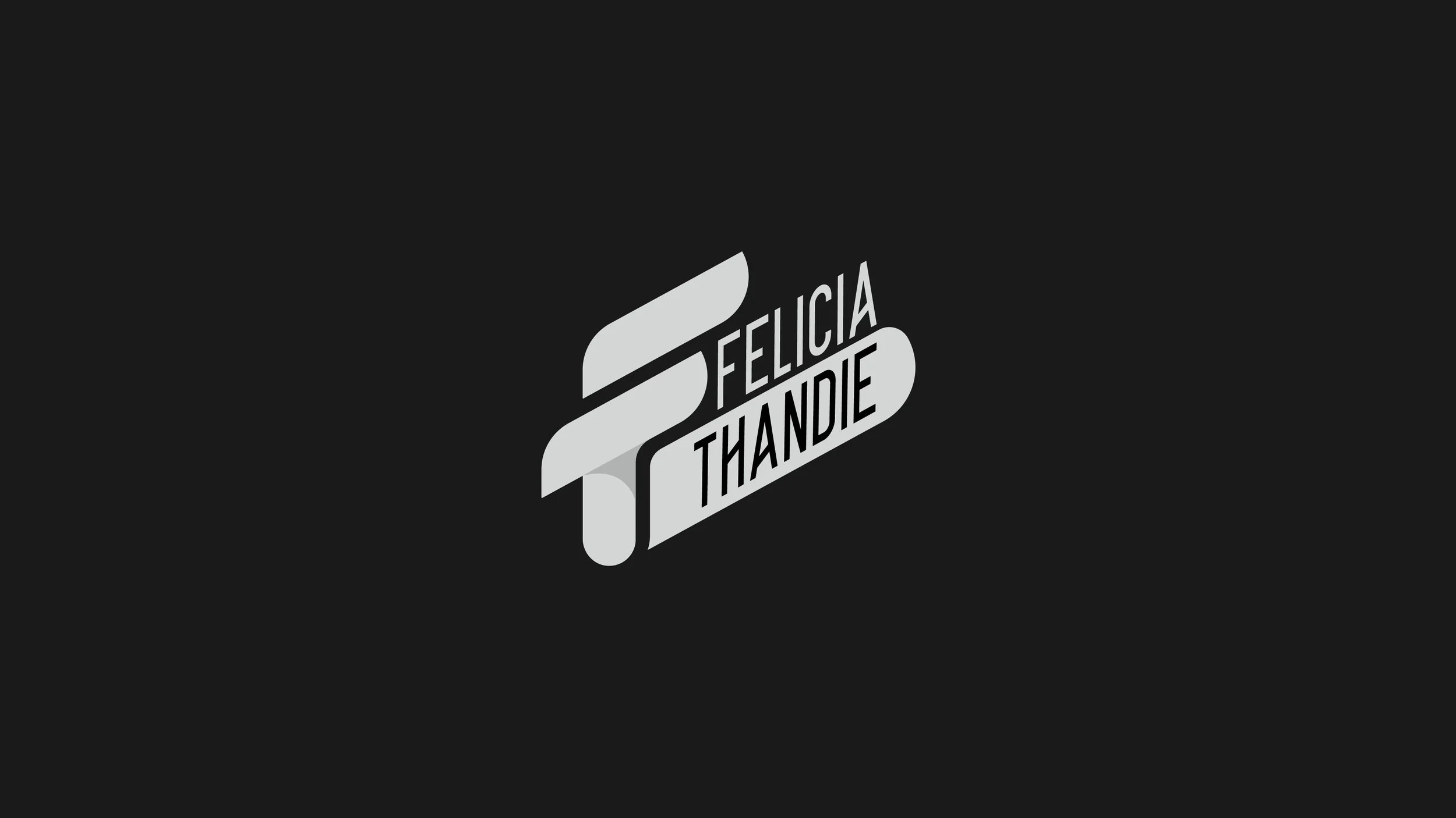
Felicia Thandie is a budding talk show host, podcaster, and social media influencer with a rapidly expanding audience.
She approached us at a defining point in her social media journey, preparing to reintroduce herself to her existing audience as she expanded into various media.
We collaborated closely with her to understand not only where she was currently, but also her long-term vision, allowing us to create a distinctive, enduring identity designed to grow with her.
-
Our brief was to design a logo that reflected her personality while remaining versatile across both digital and print platforms.
Allow me to reintroduce myself!
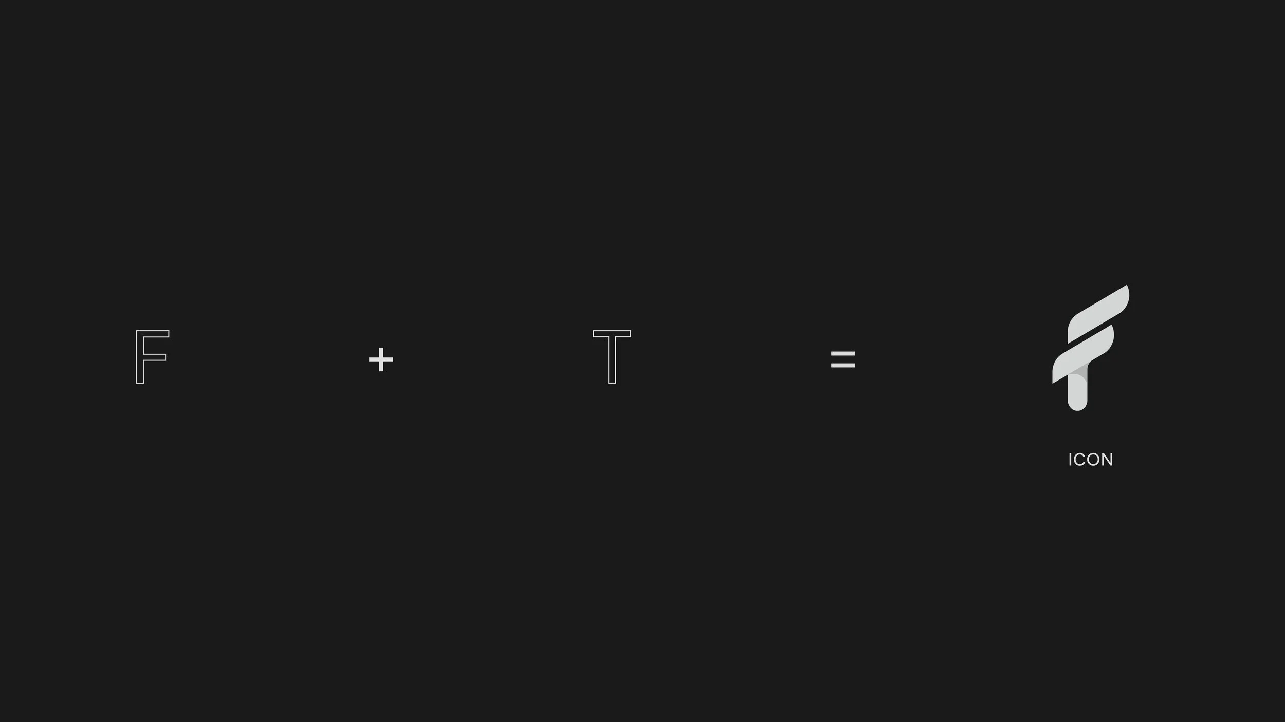
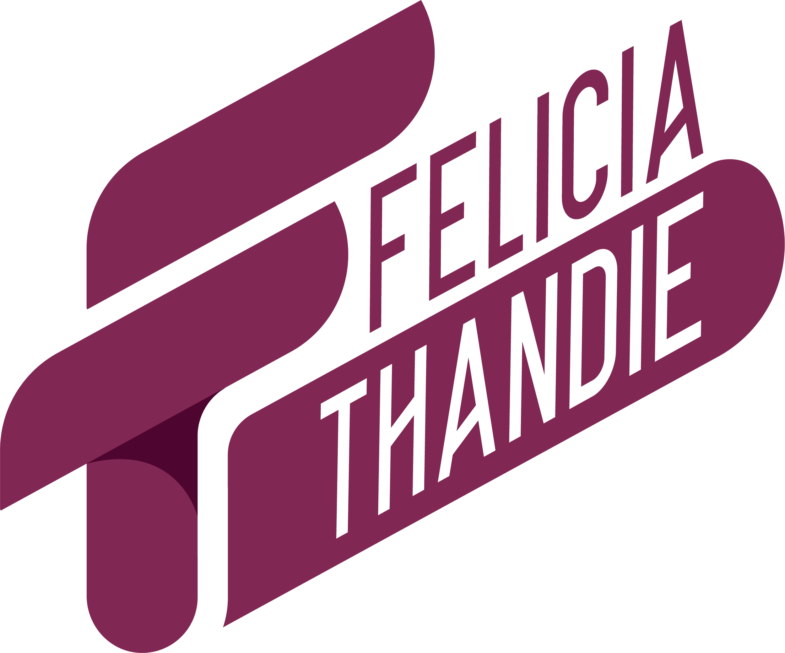
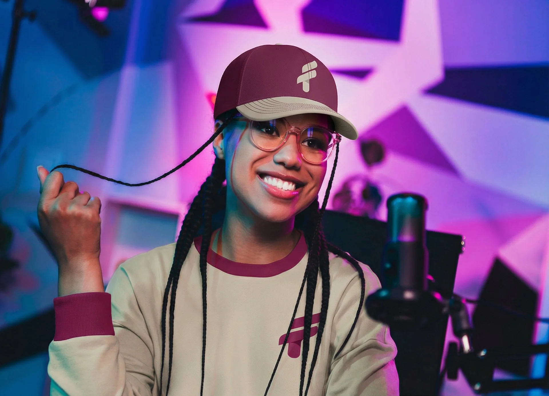
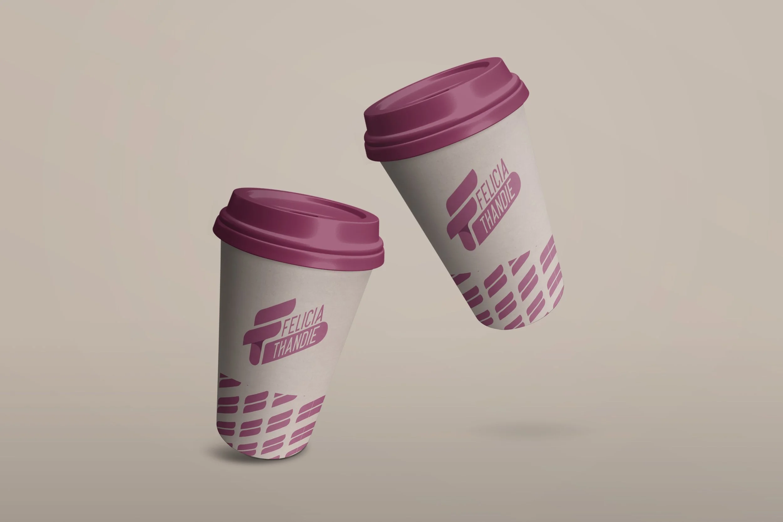
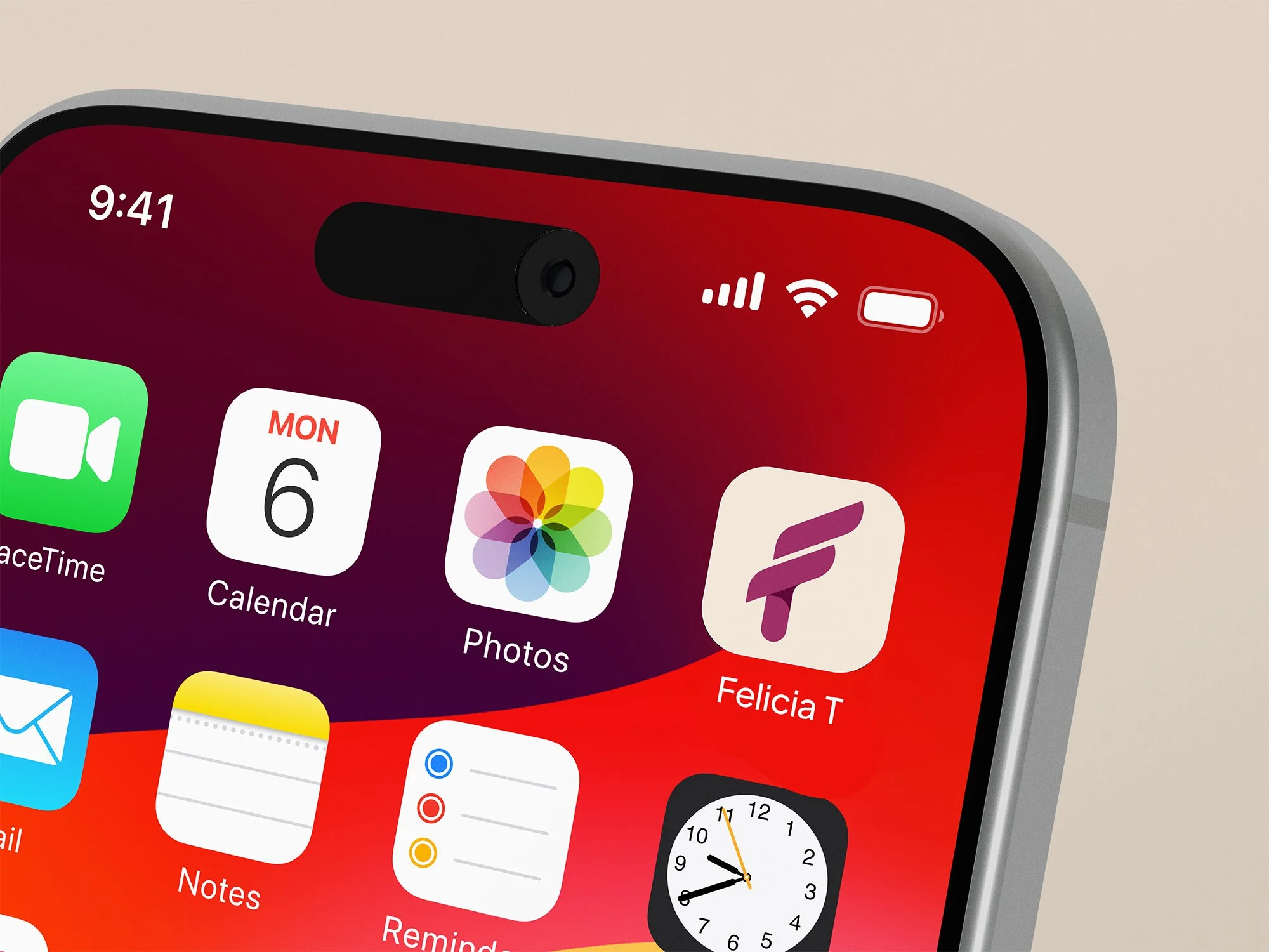
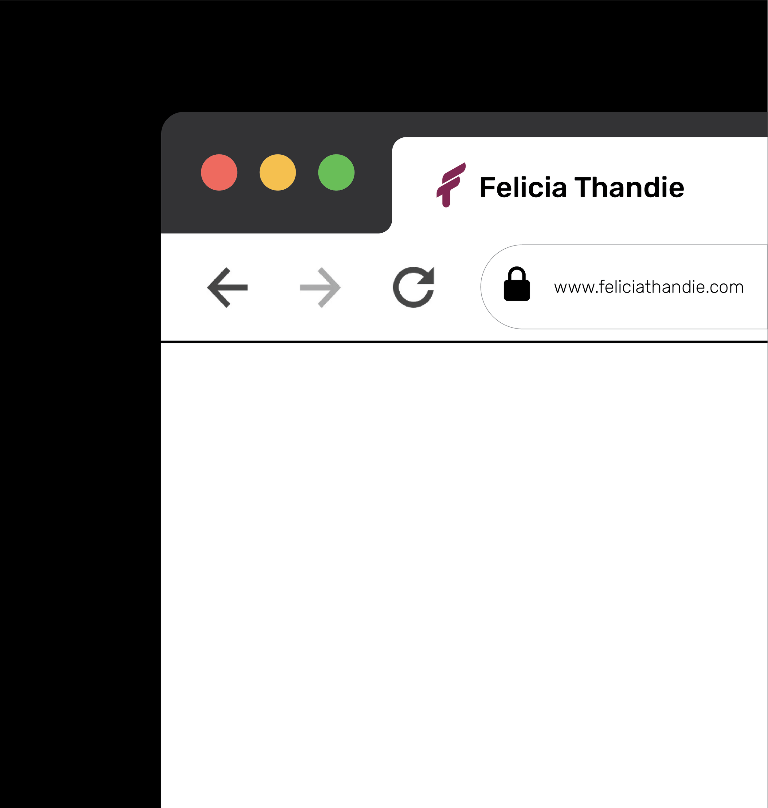
Her initials (FT) merge to create a beautifully simple and feminine mark that is instantly recognisable. The angled type adds dynamism to the design, which is reflective of her personality.
“I have been able to secure solid partnerships for my platform because of how my brand is displayed.”
— Felicia Thandie-
Before working with Re-Root Designs, my biggest challenge was not being able to visualise the type of logo that would perfectly represent my brand. I chose to work with Andrew because of his impressive portfolio and his ability to create distinctive, versatile designs — something very important to me. His work clearly demonstrated an understanding of branding across both digital and print, which aligned perfectly with what I was looking for.
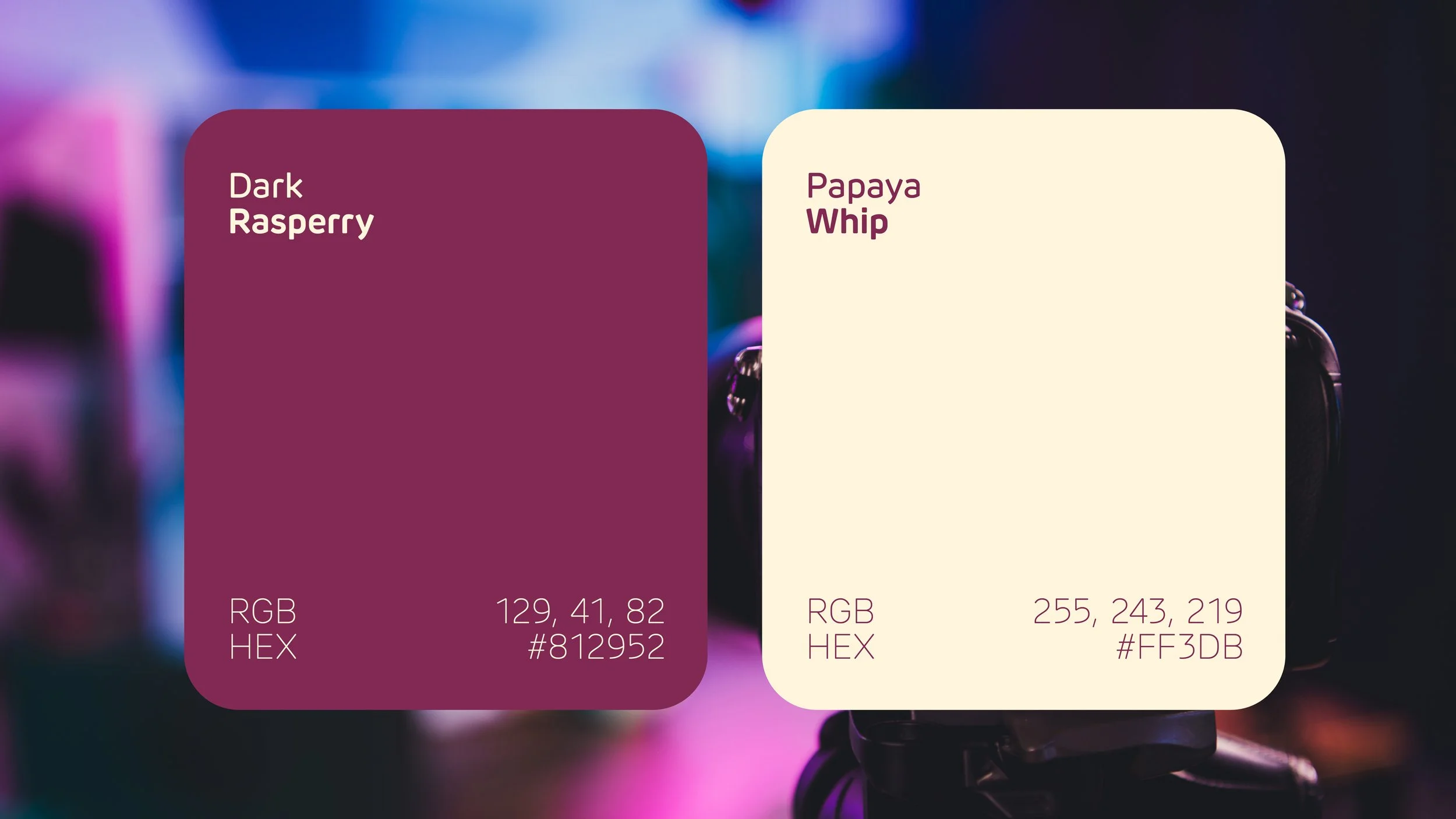
The first draft was enough. I didn't want to change a thing. And when I came back later to discuss a colour change — reflecting my own personal growth over the years — Andrew knew exactly what shade of berry to go for. That was the moment I knew he was the perfect person for the job.
What surprised me was that Andrew didn't just deliver the logo. He opened my eyes to the whole social media package — YouTube banners and beyond — things I hadn't even thought about. It pushed me to invest in my YouTube presence, and I'm so grateful for that.
Today, as an emerging host, my brand allows me to show up in spaces feeling confident and authentic. I've been able to secure solid partnerships for my platform because of how my brand is displayed — and I'm genuinely excited about what's ahead.
My advice to anyone considering working with Re-Root Designs? Don't think — just do it. Whether you know exactly what you want or have absolutely no clue, contact Andrew immediately. He is exceptionally gifted at bringing concepts to life, the communication is 10/10, and he is always open to hearing your ideas. Top quality service — and I look forward to working with him again.