

Step Ahead Social Enterprise CIC is dedicated to empowering people and enabling businesses through tailored staffing solutions, accredited training, and employability initiatives. With almost 30 years of experience, they have become a trusted partner for employers and individuals, offering comprehensive services designed to help everyone reach their potential.
-
Step Ahead needed a brand refresh to update what they now felt was an outdated look. Several issues had to be tackled, such as the lack of a suitable icon for an app or social media profile and a typeface that didn’t align with a more modern direction.
The key thing to remember—it wasn’t a full rebrand, just a refresh!

Before
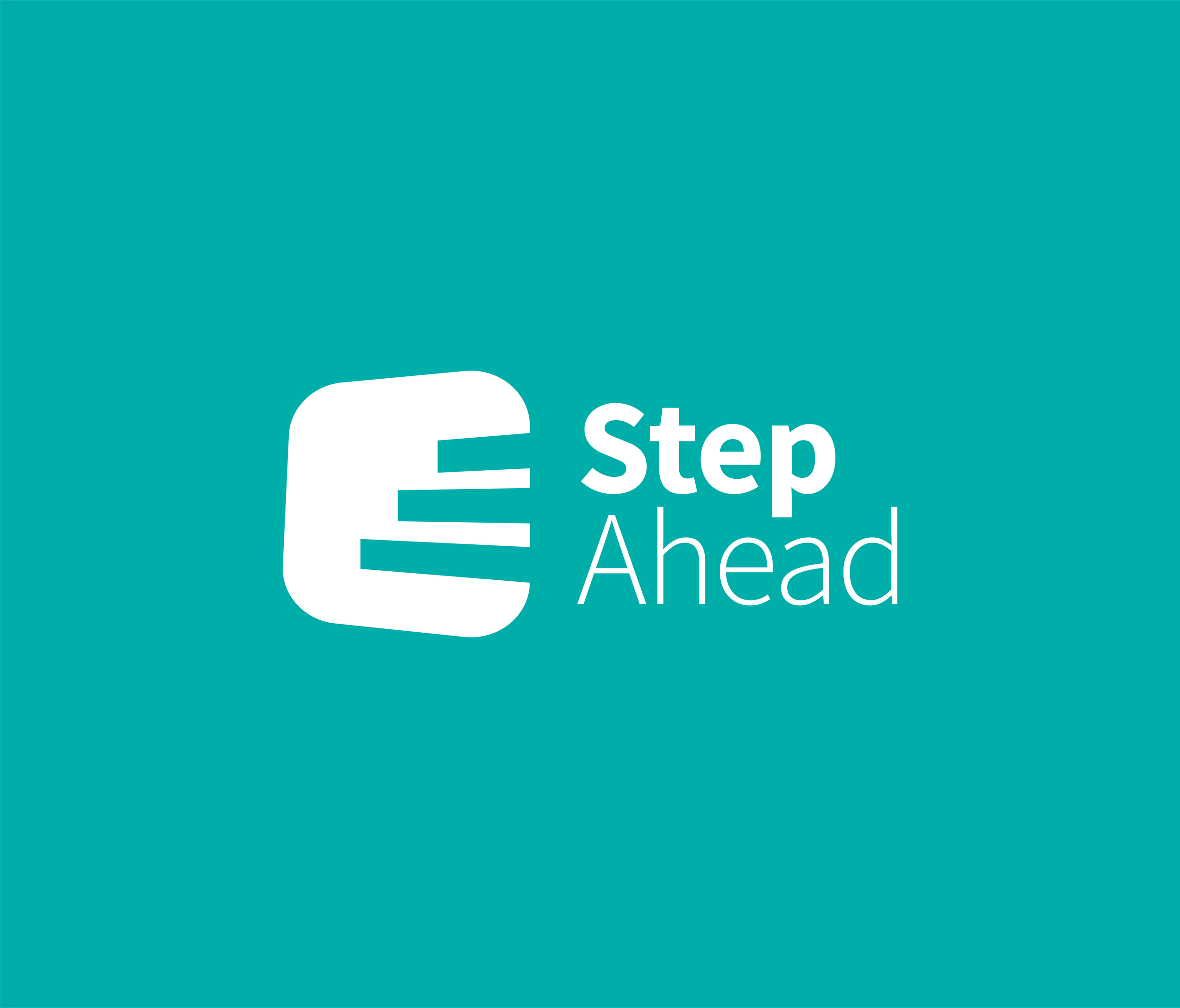
After
Freshen it up!

A staircase is cleverly incorporated into the skewed rounded square taken from the original logo. Using this element helps to maintain familiarity whilst still providing something new, fresh and modern.
-
The staircase represents progression and ambition. Job-seekers aim to progress in their lives, while the company demonstrates its ambition by taking on new, groundbreaking business opportunities.
The new typeface is modern and has an increased line weight to aid with visibility and recognition.
We also introduced a purple colour to the palette to provide contrast and depth.


